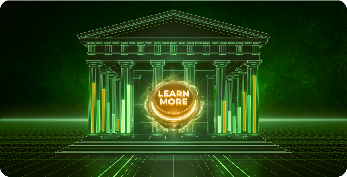
Spread the word:
Your brilliant cybersecurity solution is losing deals to poor web design.
So many solid cybersecurity companies get passed over. Not because their tech isn’t good enough. But because when prospects scan their website, they detect credibility vulnerabilities instead of security strength.
Here’s the brutal truth: prospects are making security decisions based on visual first impressions. If your site doesn’t look professional, they assume your solution isn’t either.
Here are the visual elements that transform doubt into deals:
𝗙𝗼𝗰𝘂𝘀 = 𝗣𝗿𝗼𝗳𝗲𝘀𝘀𝗶𝗼𝗻𝗮𝗹𝗶𝘀𝗺
Intentional layouts, purposeful typography, strategic white space. When every element has a clear role, prospects see a team that thinks strategically about details.
– Clean visual hierarchy that guides the eye
– Professional fonts that command respect
– Deliberate spacing that creates clarity
𝗖𝗼𝗻𝘀𝗶𝘀𝘁𝗲𝗻𝗰𝘆 = 𝗖𝗿𝗲𝗱𝗶𝗯𝗶𝗹𝗶𝘁𝘆
Uniform navigation, cohesive branding, predictable interactions. When the experience feels seamless, prospects trust you’ll deliver seamless protection.
– Unified color palette that reinforces brand strength
– Consistent button styles across all pages
– Reliable user flows from click to click
𝗙𝗿𝗲𝘀𝗵 = 𝗙𝗼𝗿𝘄𝗮𝗿𝗱-𝘁𝗵𝗶𝗻𝗸𝗶𝗻𝗴
Contemporary patterns, modern interactions, current visual trends. When your site feels cutting-edge, prospects believe your security approach is too.
– Up-to-date design that doesn’t scream “2019”
– Intuitive layouts that anticipate user needs
– Seamless interactions that mirror your solution’s sophistication
…prospects are making security decisions based on visual first impressions.
The missed opportunity? Most of these companies have genuinely impressive solutions. Their tech stack is solid, their team is experienced, their track record is proven.
But prospects never get that far because they bounce from a website that doesn’t feel as advanced as the technology actually is.
What design or copy elements instantly signal “trustworthy cybersecurity company” to you?