Spread the word:
Drowning in a sea of sameness? In the fierce battle of brands, standing out isn’t a choice—it’s a necessity. Yet, why do we find a growing trend of brands blending in, rather than breaking the mold?
From fashion to cars to phones we’re seeing “more of the same”. Take the famous fashion brands, they’ve changed their branding and now proudly wear almost identical typefaces. They went from offering tradition and some fashionable “pizzazz”, to boring and very bland logos. Don’t believe it? Check out Burberry, Balenciaga and Yves Saint Laurent, to name a few.
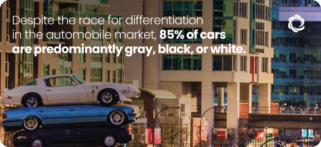
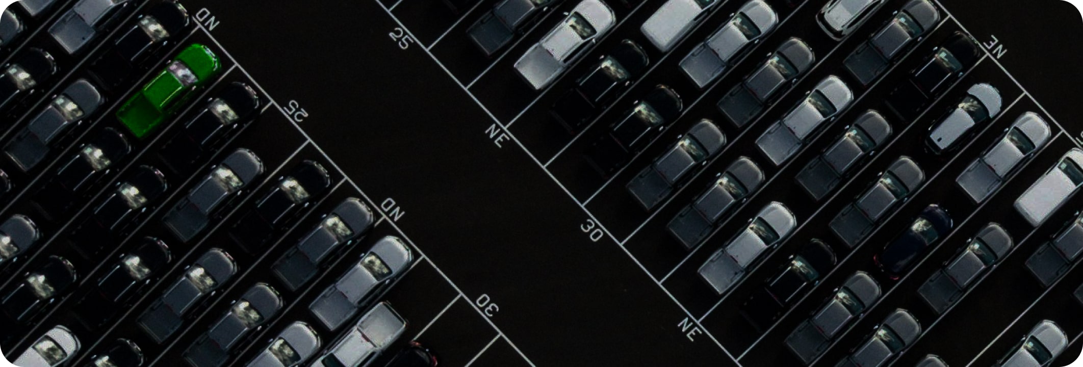
But that’s typefaces, you need to make sure that they’re all readable everywhere, everytime. Or so they say. How about colors then? Well let’s take a look at the cars we drive. Most of the cars on the road today are gray, black, or white. If you really want to go wild, you can throw in some “champagne” into the mix. It used to be that car brands wanted to be associated with a specific color to create a distinctive visual identity. Like Mustang with its iconic red and Porsche with the Miami Blue. However, for a variety of reasons (a whole other post worth of reasons), we’re left with a very minimal color palette on the roads nowadays.
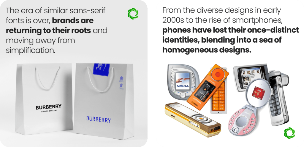
Last but not least – let’s take a look at our mobile phones. Where once you had crazy Nokia colors and shapes, we are now all holding slick black, silver and white devices that are very hard to tell apart. Granted of course, that you can buy your own phone case and go glitter-crazy or reach out for the classic transparent cover. But with the devices looking that similar and with features that are just marginally different from one brand to the next, it is no wonder that phone brands are fighting tooth and nail to keep their market share. And yes yes, the iPhone is totally different – I’d agree with you 8 years ago, when Apple claimed they had 92% of the smartphone market. Today, with a 20% share? Not really.
…differentiation is never more important than it is in times of trouble, and that’s the time when everyone tends to go to the well and equalize rather than differentiate.
Jack Welch
So is it even worth trying to go up that differentiation hill? I think yes. And we’re starting to see brands that are coming back from the gray standard. The previously mentioned Burberry is one of them. They went back to the drawing board this year and created a “new” logo that is rooted deep in their traditional one. Of course visual identity is just one of the business aspects where you should consider differentiation. But I believe it’s a good start, and sometimes it is much easier to tackle than your actual product or service.