Ever wondered how to make your charts more effective?
Check out these creative visual tips.
We all know that charts and graphs can make your audience tune out. So let’s make sure that doesn’t happen.
Here are some super simple steps to turn your data into a visual story that grabs attention and keeps your audience engaged:
Pick your graph: The type of graph you choose can make a huge difference. Bars, lines, pies—each has its own strength. Pick the one that best represents your data and the story you want to tell.

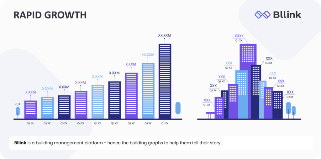
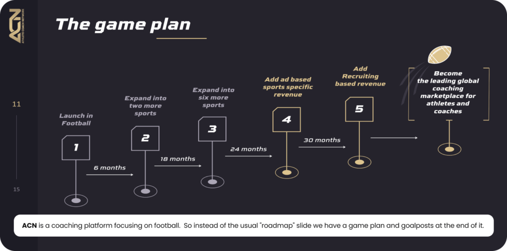
Customize: Tailor your chart visuals to reflect your industry. This not only makes your data more relatable but also helps your audience connect the visuals to your industry immediately.

Tell a story: Data by itself can be dry. Connect the dots visually and textually to show your progress, challenges, or market dominance. Use your charts to reinforce your business narrative and make the data meaningful.

By incorporating these steps, you can turn your presentations from mundane to memorable and make your data not just seen, but remembered.
Make sure your custom infographics are both creative and clear, so they really get your message across.
Also, think about who you’re showing them to and where they’ll be seen to make sure they hit the mark with your audience.


