Spread the word:
Think your work is complete? Take a step back and see what ‘space’ can do for you.
We have too many features to unpack on a screen. Too many clients that we want to show off and say that we’ve worked with. Too many screenshots of the platform that we absolutely must show.
We talk about color schemes, branding, and eye-catching images, but we forget all about space. A balanced, well designed webpage is not just about the elements we see; it’s also about the space between them. Space isn’t just a blank area, it allows for balance, emphasis and clarity.
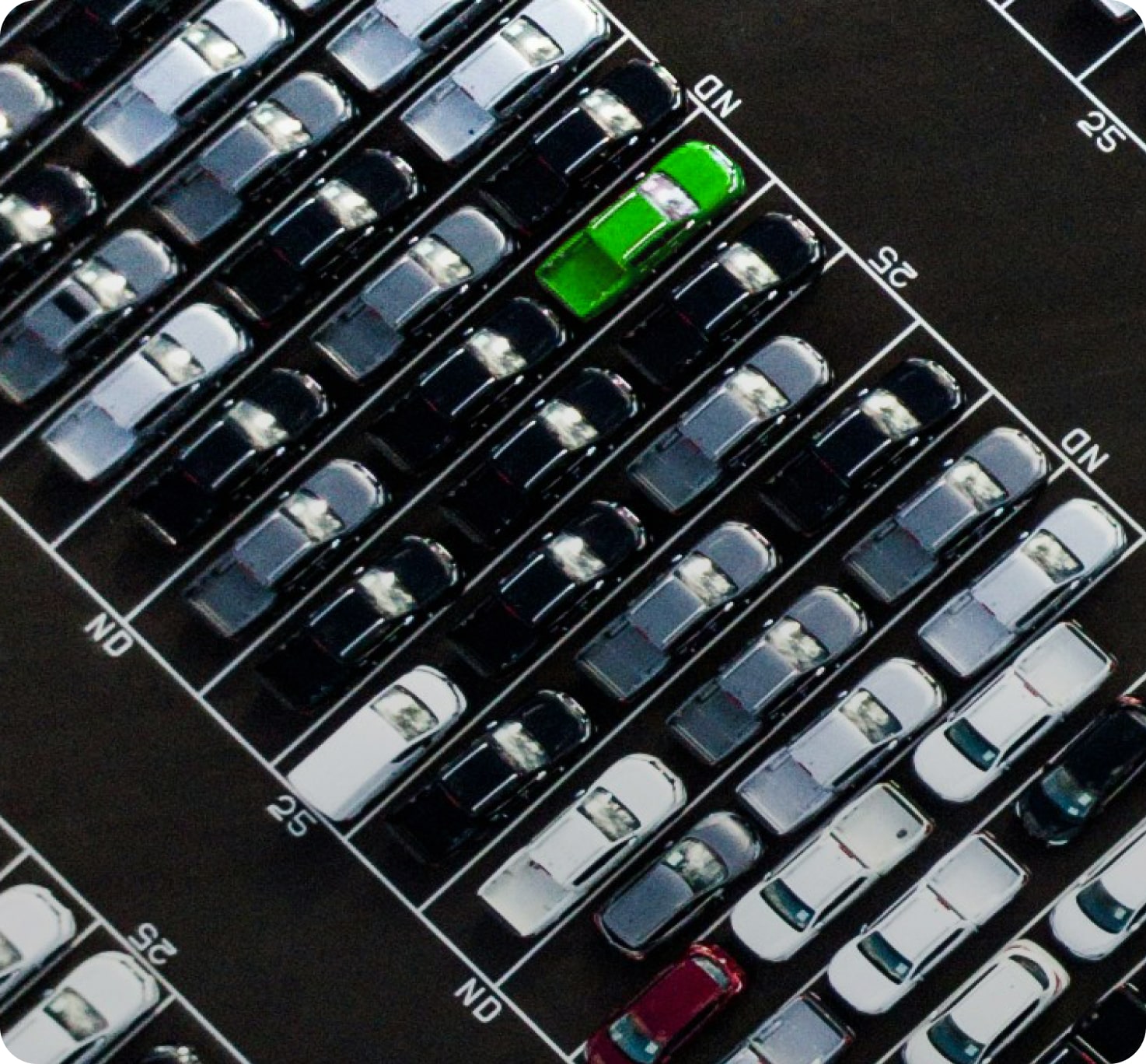
Balance: Space is the unseen framework that holds a design together. Think of it as evenly distributing visual weight, allowing each element, from text to images, its own ‘personal space’. This balance prevents visual chaos, making the design appealing and digestible.

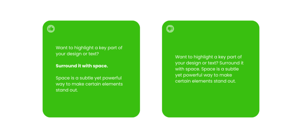
Emphasis: Want to highlight a key part of your design or text? Surround it with space. This draws the viewer’s eye directly to the focal point, whether it’s a logo, headline, or call-to-action button. Space is a subtle yet powerful way to make certain elements stand out.
Clarity: Clarity is all about making your message clear and accessible. Space breaks down complex information, making it easier to understand. From the spacing between letters to the gaps between paragraphs, it’s crucial for readability and comprehension.
In short, space in design isn’t just emptiness.
It’s a vital, active ingredient in creating visual stories that are harmonious, focused, and clear.So next time you’re writing or designing a webpage, remember to leave some space.